20 Awesome Responsive Websites
The key point of a responsive web design is creating flexible websites, the websites that would fit different screen sizes. However, it doesn’t necessarily mean that the layout will look the same in different browsers; this approach only ensures the best user experience whatever device the site is being viewed on.
Now, we’d like you to see some awesome examples of responsive web design. We hope you will like that each responsive website is available in 3 sizes; just as you would view it on your desktop, tablet and mobile.
Btw, if you wish you can test the following sites (as well as other responsive websites) on different devices without actually having them  For instance, you can use iPadPeek to see how the website looks when viewed with an iPad, and then switch to TestiPhone to see what mobile users will see when they visit the same website.
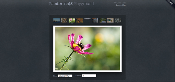
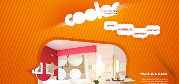
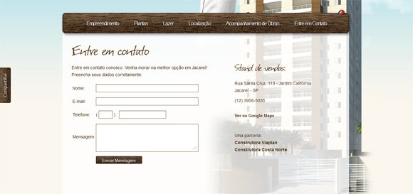
With the growing number of people using tablets, netbooks and mobile devices to go online, more and more websites are designed to be responsive and adaptive, and if you’re looking for some inspiration before making your site responsive, you’ll definitely find it here.
Don’t forget to subscribe to our RSS or Follow us on Twitter if you want to keep track of our next post.
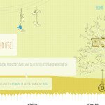
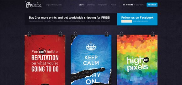
01. inflexioninteractive
02. trentwalton
03. oliverrussell
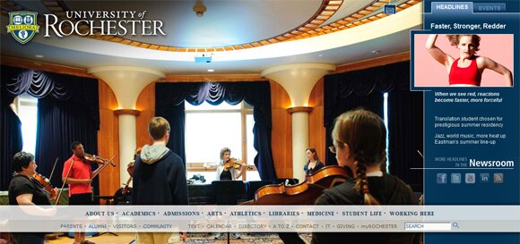
04. denisechandler
05. 2012 dconstruct
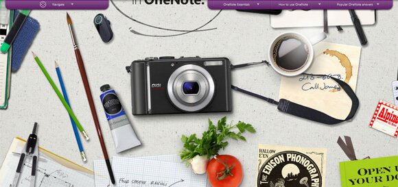
06. enochs
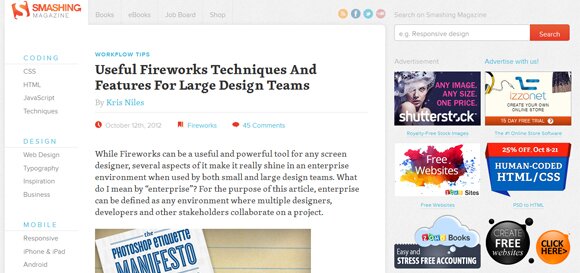
07. createdm
08. webcoursesagency
09. morehazards
10. colbowdesign
11. foodsense
12. hillsong
13. brickartist
14. startupbritain
15. anthonycalzadilla
16. unitedpixelworkers
17. bahstonfilmcritic
18. colazionedamichy
19. sleepstreet
20. wcst
Article By: Helen Bailey
Helen Bailey is a Marketing Assistant working for Template Monster. She enjoys writing design-related articles and her favorite topics are website templates and WordPress templates from TemplateMonster.com, design freebies and the latest web design trends.


you excellent collection of web designs.
There is a great collection of high quality responsive websites. I really feel that responsive sites can bring in a personal touch to a sites design and also aid the user if they are on a smaller screen. It is amazing to see how the different media scripts run in order for the resizing to take place. Thank you for sharing 20 sites they will be a great inspiration to me in the future.
Awesome collection. Responsive web pages are a huge plus for businesses.