Look Upon 10 Best & Impressive Responsive Design Websites
In the field of website design and development, everyone is quickly getting points, but still unable to keep up endless new resolutions and devices. It is impractical to create a website version for many websites that provide each type of resolution for new devices.
Responsive website design is the approach that suggests to your web development and design to have a technology, which automatically responds according to user’s preferences. It responds user’s computer screen based on platform, screen-size and orientation with flexible layouts and grids, CSS media queries and images.
Responsive website design is very important for the business owners, who have online website. According to Google Analytics, around 33% people search through mobile phones. Here are three vital elements:
- Flexible layout
- Flexible Images
- Media Queries
As always, our goal is to inspire and inform. Today, we have collected top 10 outstanding websites of responsive designs. These sites have a great look and feel with any screen-size device. For those, you want to dig a little bit & check out yourself, how much effective those websites work:
National Society of Collegiate Scholars
The National Society of Collegiate Scholars’s website has ingeniously design for the Millennial generation. This site is amazing in look and feel, easily resizable images, mobile compatible and clearly focus on the organization’s membership. The layout of this site can open with almost mobile phones.
CSSChopper

This site is a good example of responsive web designing. It provides easy drag and drop facility even with cell phones. You can enlarge the size of content and image according to screen-size device.
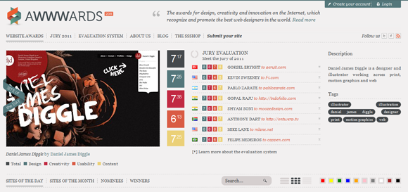
AWWWARDS
AWWWARDS is an example of innovative website design that has creative displays on home page. It boasts our top choices in responsive design. This site has done great job with simple and creative designs. The main focus is on site promotion rather than too much designs.
No-Refresh
A different design that explains everything related to services, easy to resize images as well as content via mobile. It is a simple and clearly design website with mobile-ready layout.
Dadaab Stories
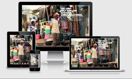
An awesome video is added on the home page of this site. It is one of the best responsive innovations that influences you to say ‘wow’. This website actually transport you the story of “Dadaab African Village” through movie like header. It has attractively design feature that seamlessly provides a message. Quick scrolling facility with straightforward screen options, which makes its design impressive and you feel good about this site.
The Haberdash Fox
The Haberdash Fox’s website has crispy collection that can create a fantastic shopping experience. Its navigation is intuitive with well-dressed images. This site has menswear collection only in clothes. This is not so much impressive and eye-catching website on the basis of responsive design.
The Children’s Museum in Pittsburgh
This site is an example of bright, colorful, readable multimedia layouts that can attract to the parents for their children. The “Children’s Museum in Pittsburgh’s website” has a whimsy touch that fits for kids only not for all.
Sketchin
This site is not good in designing. They tried to focus on their area of expertise just like an international user experience design company. I didn’t see any creativity in this website.
Contents Magazine
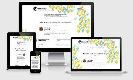
According to me, this is not an example of responsive sites. They have just focused on the images of author and brief description of them. This site is very simple.
Disney
Disney can make happier to its fans with their favorite characters only. This site has done great a job through showcasing the company’s animated stars over all screen medium. Go ahead with this site and try to make compatible with all browsers seamlessly rather than stars.
Don’t forget to subscribe to our RSS or Follow us on Twitter if you want to keep track of our next post.
Author: David meyer
The highly-skilled and experienced website developer, David Mayer is working at Webgranth. He has created number of websites and also has shared his innovative ideas through blogs/articles.


